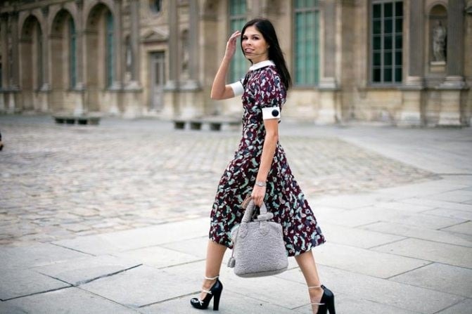
Photography is not just a visual image, but a way to convey a sensation, atmosphere, history. One of the most powerful tools, with which the author can affect the perception of the picture, is color. Color is able to radically change the emotional subtext of the image: it soothes or worries, inspires or alarms, makes the frame warm and cozy or detached and cool.
On the blog Edit With Gimp We consider the photograph as a form of visual utterance. Today's topic is devoted to how to control the mood of the picture with the help of color, making it expressive, deep and memorable. Work in the GIMP editor allows you to subtly set up a palette, balance and the structure of shades, creating not just a beautiful image, but a complete artistic statement.
Color is perceived not only visually - it acts on the subconscious. Visual incentives cause us emotional responses, often without a conscious analysis. This is the basis of color psychology, and it is it that makes color such an important tool in photography.
Each color carries its own emotional code:
Depending on the combinations and proportions, these shades can form the mood of the frame - from joy to melancholy, from comfort to tension.
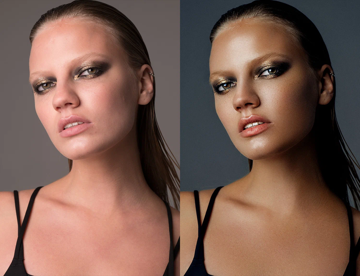
The color in the frame is not only the choice of the shade itself, but also its saturation, temperature, contrast and interaction with other image elements. Even neutral scenes can play in a new way when changing the color balance.
GIMP provides several key tools that allow you to accurately monitor the color scheme of the picture:
Having mastered these tools, you can not only edit colors, but consciously control the atmosphere of the image.
This is a basic, but powerful tool for creating the desired color context. For example:
In GIMP, you can selectively change the tone and saturation through specific colors (red, green, blue, etc.), without affecting other areas, which is especially convenient with portrait and subject shooting.
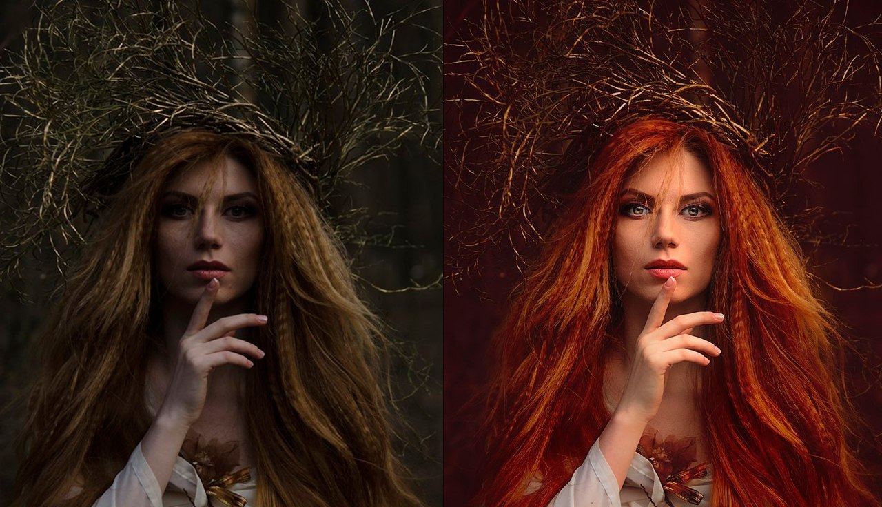
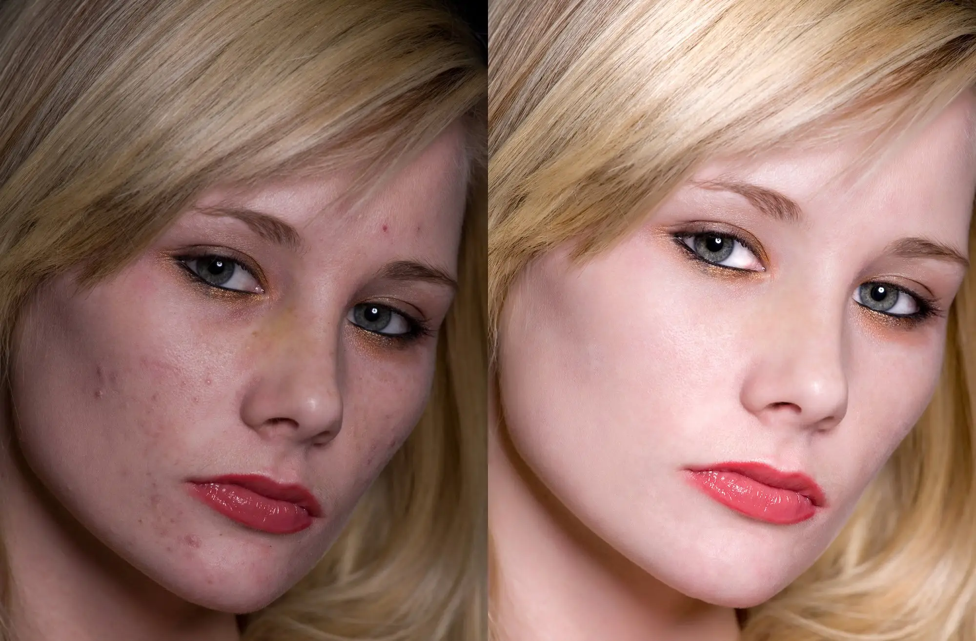
The incorrectly exhibited white balance is able to destroy the atmosphere of the picture. A cold shade can even make a warm interior detached, and too warm light gives faces an unnatural yellow tint.
Balance adjustment is the first step to setting the mood for the frame. In GIMP, you can set a gray point or use manual curves to soft correction of the color temperature.
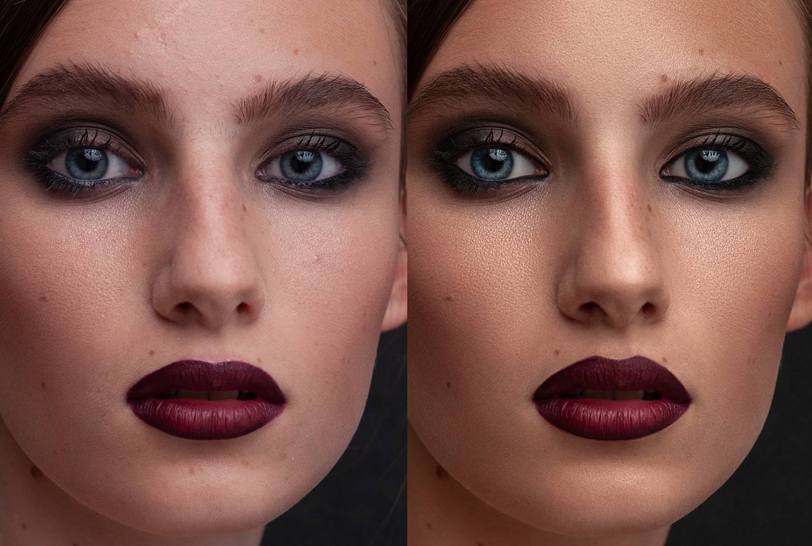
Curved is a professional tool that allows you to accurately control not only brightness, but also with color channels. With their help, you can:
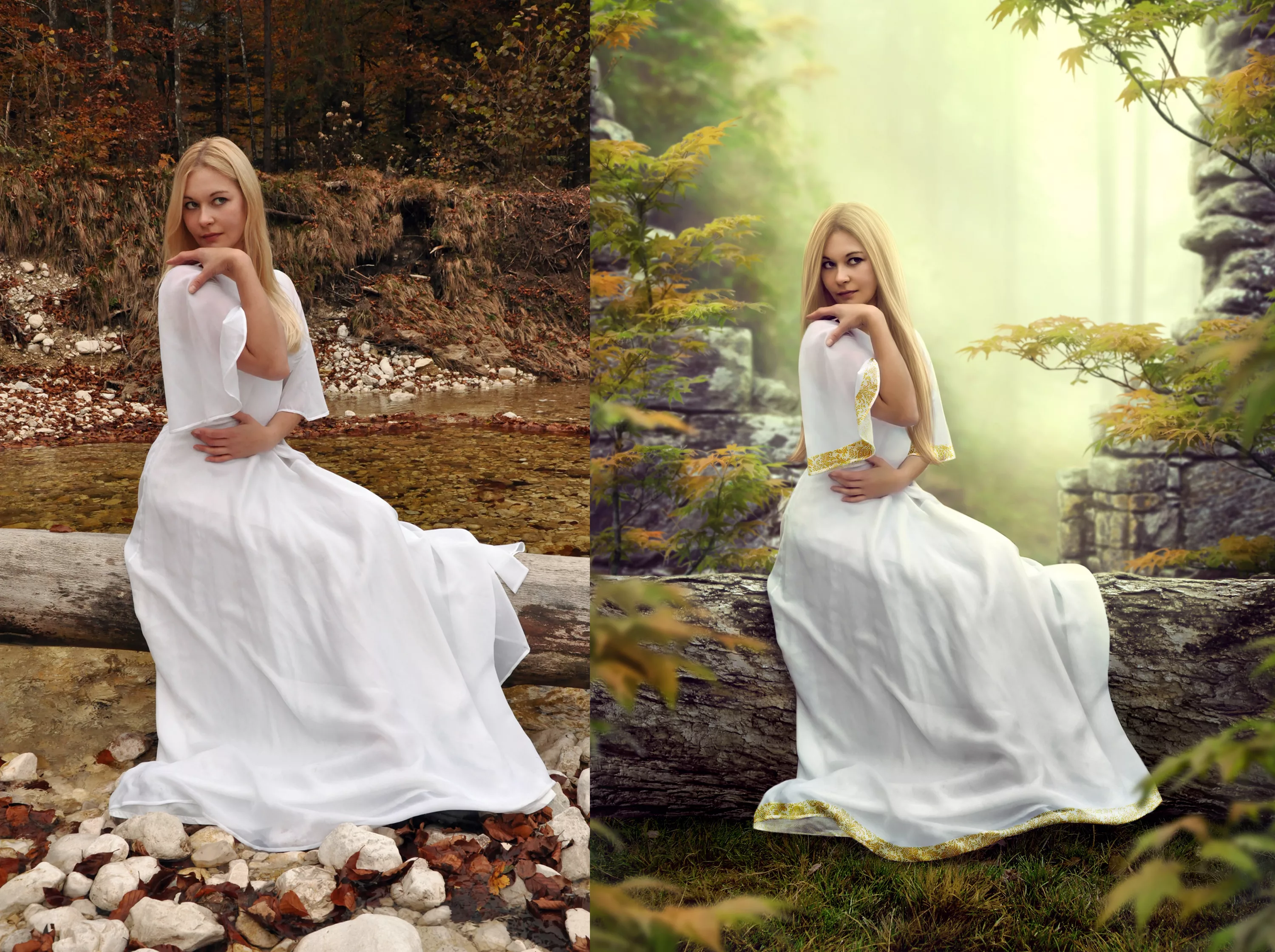
For example, you can make the shadows slightly purple, and the light is warm, golden, creating a cinematic effect.
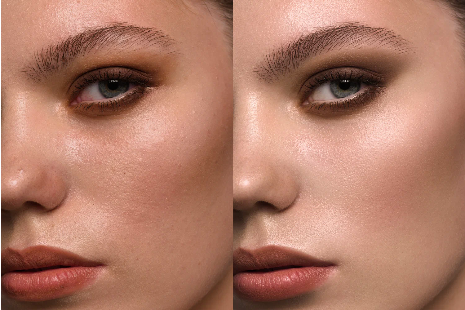
This is a technique in which you add different shades in the shade and in light areas of the image. This allows you to not just adjust the color, but give the photo the character.
Examples of moods:
Separate tinting is especially appropriate in portraits, landscapes and atmospheric street photography.
Color can be used to create rhythm, accent and balance. Sometimes exactly one color element is able to hold the viewer's attention and lead his gaze along the frame. Contrast colors - orange and blue, red and green - work as dynamic opposites, creating stress and energy.
Restrained, monochrome gamma - beige, gray, blue - create a feeling of silence and depth.
Before editing the picture, ask yourself the question: what emotion do you want to convey?
GIMP makes it possible to use color as an expressive language-if you begin to perceive it not as a technical task, but as a tool of the story, each frame will begin to sound in a special way.
Color is not just a visual characteristic of the image. This is an emotion, atmosphere, a voice of photography. It allows the viewer to feel that it is outside the frame - mood, weather, inner world of the hero or author.
By editing photos in GIMP, you get access to a wide range of color schemes. The main thing is not to strive for a universal formula, but to look for your combination, your character, your palette. On the blog Edit With Gimp We are sure: the understanding of color is the path to expressive photography, which speaks not only an eye, but also with a heart.
Hello and welcome to our website! We are glad that you are with us. Our site offers the latest news and articles to keep you up to date. We hope you have a great time here and get in a good mood.


Dominic Doherty
Great blog! You explain complex topics in a very clear and interesting way.
Mariya Humphrey
Just adore your blog, always find interesting topics, simply explained, and easy to understand. Thank you!